.svg)


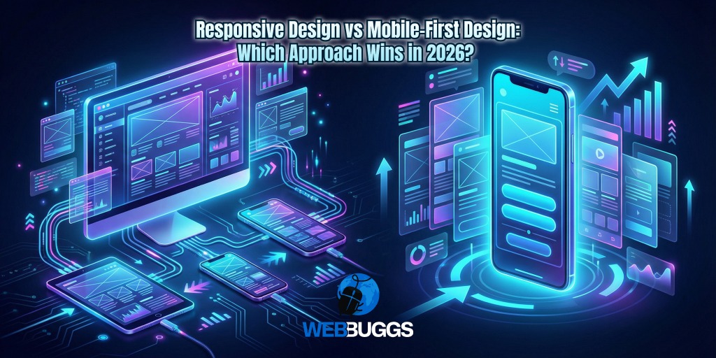
Responsive Design vs Mobile-First Design: Which Approach Wins in 2026?
Having a website isn’t enough in 2026. It should facilitate a frictionless transition between multiple devices. Responsive Design vs Mobile-First experience, they’re going to be the two main streams to decide the ranking paths.
In this split-second world, your website just has 2.5 seconds to prove its worth. Yeah, that’s absolutely true. The digital landscape is now completely shifted. WEBBUGGS sees this struggle daily, where giant businesses lose their leads due to their website’s clunky interfaces.
What will be your website’s UI/UX strategy in this situation? What will you choose, responsive design or mobile-first design? We know that time value. That’s why we give personalized solutions that help in reducing the user bounce rate and urge them to click. Interestingly, both web and mobile designs are crucial for a smooth and interactive interface. But the ultimate user journey aims seamless experience that fascinates visitors every time.
The Core Conflict: Adaptation vs. Prioritization - Choose Your Path
Businesses and brands must understand the technicalities of these two methods, responsive design and mobile-first experience. They should ensure to bridge the gap between the two if they want to rank their custom business websites. Let’s take a look at them one by one.
What is Responsive Web Design?
As its name implies, responsive web design is traditionally made to boost the “desktop-down” approach. It simply means these websites are developed for large-screen monitors, which are also known as feature-rich sites. They use CSS media files to scale it down for small screens, called graceful degradation.
What is Mobile-First Design?
Luckily, we all knew that approximately 60% of a website's traffic directly comes from mobile. So in this mobile-living era, we can’t deny the worth of “Mobile-Responsiveness”. Additionally, mobile-first designs help you establish the most vital content, and then you can make progressive enhancements.
Why Mobile-First Wins the SEO Battle in 2026
Mobile-first definitely wins, as cyberspace is shifting from “mobile-friendly” to “mobile-only” reality for search engines. Now, mobile-first indexing is in authority, which means your website is only ranked if it's perfectly enhanced its User Experience. The experts at WEBBUGGS are diligently working in SEO to maintain this gold standard. We work for high-performance website development and ranking solutions. Let’s discuss how we work together to make a mobile-first design winning process successful.
1. Lightning-Fast Core Web Vitals
Because the mobile-first sites are leaner, we make sure to eliminate the desktop bloat during the development phase. We do this for LCPs, FIDs, and CLS.
- LCPs: The Largest Contentful Paint (LCP) helps images to load instantly.
- FIDs: The First Input Delay (FID) is mainly responsible for the website’s immediate response.
- CLS: All the elements are aligned and can’t jump around during the site loading due to Cumulative Layout Shift (CLS) core web vital.
2. Enhanced User Experience (UX)
WEBBUGGS explicitly prioritizes “thumb-friendly” user navigation. That’s why the user journey is exciting. Our developers mainly focus on:
- Action-oriented and large call-to-action (CTA) buttons.
- Best vertical and horizontal scrolling experience.
- Clear and easy-to-navigate menus that give a visible solution.
Does Responsive Design Still Hold Value?
The answer is clear, yes. The responsive approach has its own worth. It’s best used for heavy-duty platforms, such as:
- B2B Dashboards: At workplaces, it helps the user to access the tools via a desktop.
- Content Hubs: When the websites have complex tables and side-by-side comparisons, design responsiveness helps you a lot.
- Legacy Migrations: When you need to migrate a large amount of data with full-proof security and mobility, it performs well.
Which Performs Well? Responsive Design vs Mobile-First
Feature
Responsive Design
Mobile-First Design
Primary Device
Desktop and Laptop
Smartphone and Tablet
Development Path
Desktop → Mobile
Mobile → Desktop
Speed Factor
Potentially Heavy
Highly Optimized
SEO Strength
Good
Superior
How WEBBUGGS Works To Bridge the Gap?
WEBBUGGS doesn't just pick a site; we build for performance. Our custom web development services leverage the best of both worlds. We ensure your site is ready to compete in this "AI Overview" era.
Value of AI-Ready Content Structure
We know that search engines and AI models prefer structured data. We ensure your site uses:
- Clean HTML5 Semantics: Helping AI understand your headers and lists.
- Schema Markup: Making your business details "readable" for AI snippets.
- Optimized Assets: Using WebP and SVG formats for maximum speed.
Choose WEBBUGGS for Long-Term Adaptability and Resilient Growth
The debate of Responsive Design vs Mobile-First isn't about which looks better; it's about where your customers are. The world’s digital arena is moving so rapidly with the new trends and technologies. Business owners and marketers should adapt mobile-first reality for the long-term growth of their businesses and brands.
WEBBUGGS offers tailored services that suit your needs. We have the growth-first mindset that helps to scale your business to the next level. So, if you’re ready to transform your online presence that stands out, without any waste of time, just contact us. We’ll give you the perfect solutions to convert your visitors into potential customers.


.jpg)