.svg)


7 Common Checkout UX Mistakes Killing Your Conversion Rates (And How to Fix Them)
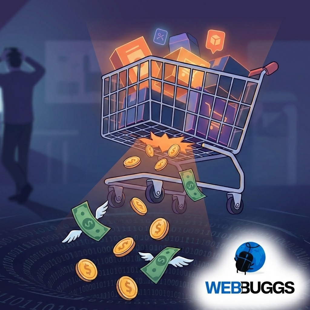
In the world of e-commerce, the checkout page is the moment of truth. You’ve paid for the ads, you’ve optimized your product pages, and the customer has added an item to their cart. But then... silence.
In 2026, the average cart abandonment rate still hovers around 70%. While some window shopping is inevitable, a significant portion of these lost sales is due to friction. If your checkout process isn’t seamless, you are literally handing money to your competitors.
Here are the 7 most common checkout UX mistakes we see at Webbuggs, and exactly how to fix them to reclaim your lost revenue.
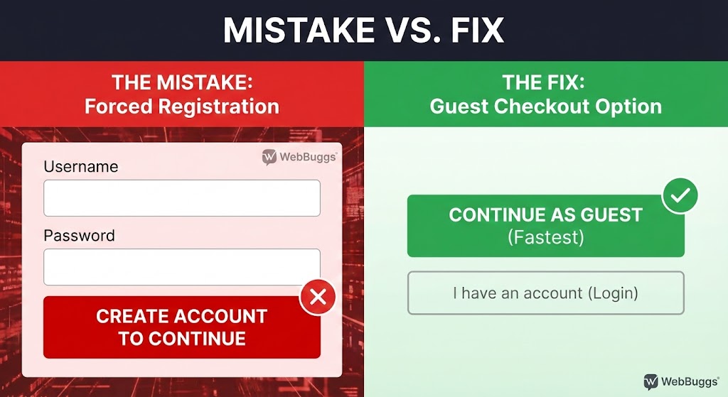
1. Forcing Users to Register an Account
This is the number one conversion killer. In 2026, customers expect speed. Forcing a first-time buyer to create a password and verify an email address adds unnecessary friction.
The Fix: Always offer "Guest Checkout." You can ask them to create an account after the purchase is confirmed to track their order.
2. Hidden Costs Appearing at the End
Nothing breaks trust faster than a "surprise" shipping fee or tax addition on the final payment screen.
The Fix: Be transparent. Include a shipping calculator on the product page or offer flat-rate or free shipping thresholds prominently in the header.
3. A Slow, Clunky Interface
Every second of delay reduces conversion by 7%. If your checkout page takes 5 seconds to load, your customer is already gone.
The Fix: Optimize your code structure. At Webbuggs, we use lightweight frameworks (like Next.js) to ensure checkout pages load instantly, even on mobile data.
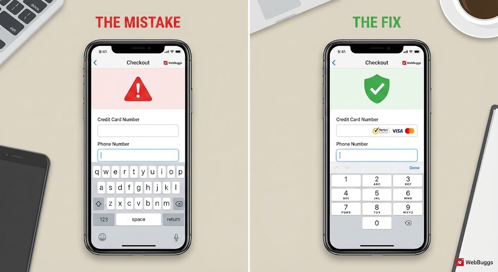
4. Lack of Trust Signals
With cyber threats evolving, customers are more cautious than ever. If your checkout page looks outdated or lacks security badges, they won’t enter their credit card info.
The Fix: Display security badges (SSL, Norton, etc.) and payment icons (Visa, PayPal, Apple Pay) clearly near the "Place Order" button.
5. Asking for Unnecessary Information
Do you really need their phone number if you aren’t sending SMS updates? Do you need their company name for a B2C purchase?
The Fix: Adhere to the "Less is More" principle. Only ask for what is strictly necessary to deliver the product.
6. Not Optimizing for Mobile Keyboards
If a user clicks the "Phone Number" field and sees a full QWERTY keyboard instead of a number pad, you’ve created friction.
The Fix: Use proper HTML input tags. Ensure the numeric keypad triggers for zip codes and phone numbers automatically.
7. A Complicated Navigation Bar
Once a user enters the checkout flow, you don’t want them clicking away to read your "About Us" page.
The Fix: Remove the main navigation menu during checkout. Keep the focus entirely on completing the purchase.
Conclusion:
Fixing these UX mistakes isn’t just about design. It’s about revenue. A simplified checkout experience can increase conversion rates by upwards of 35%.
Is your store leaking revenue? At Webbuggs, we specialize in high-performance e-commerce development. Contact us today for a comprehensive UX audit and let’s turn those abandoned carts into completed sales.


.jpg)